Product Comparison
Walgreens Adaptive Site: New feature for users to compare products while shopping.
Client
Role
Research, UI design, Wireframes
Overview
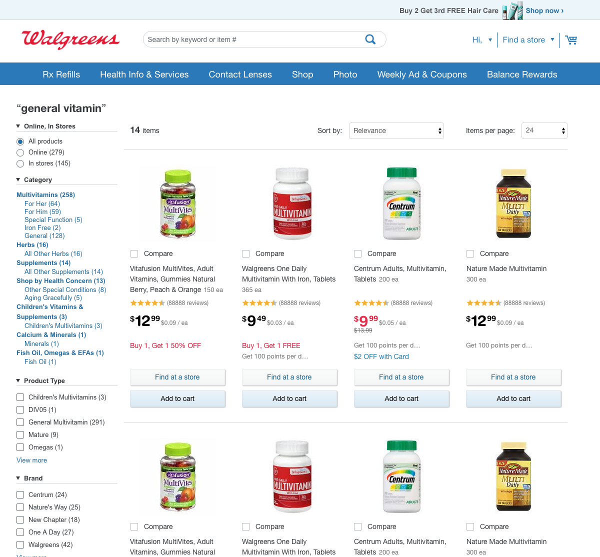
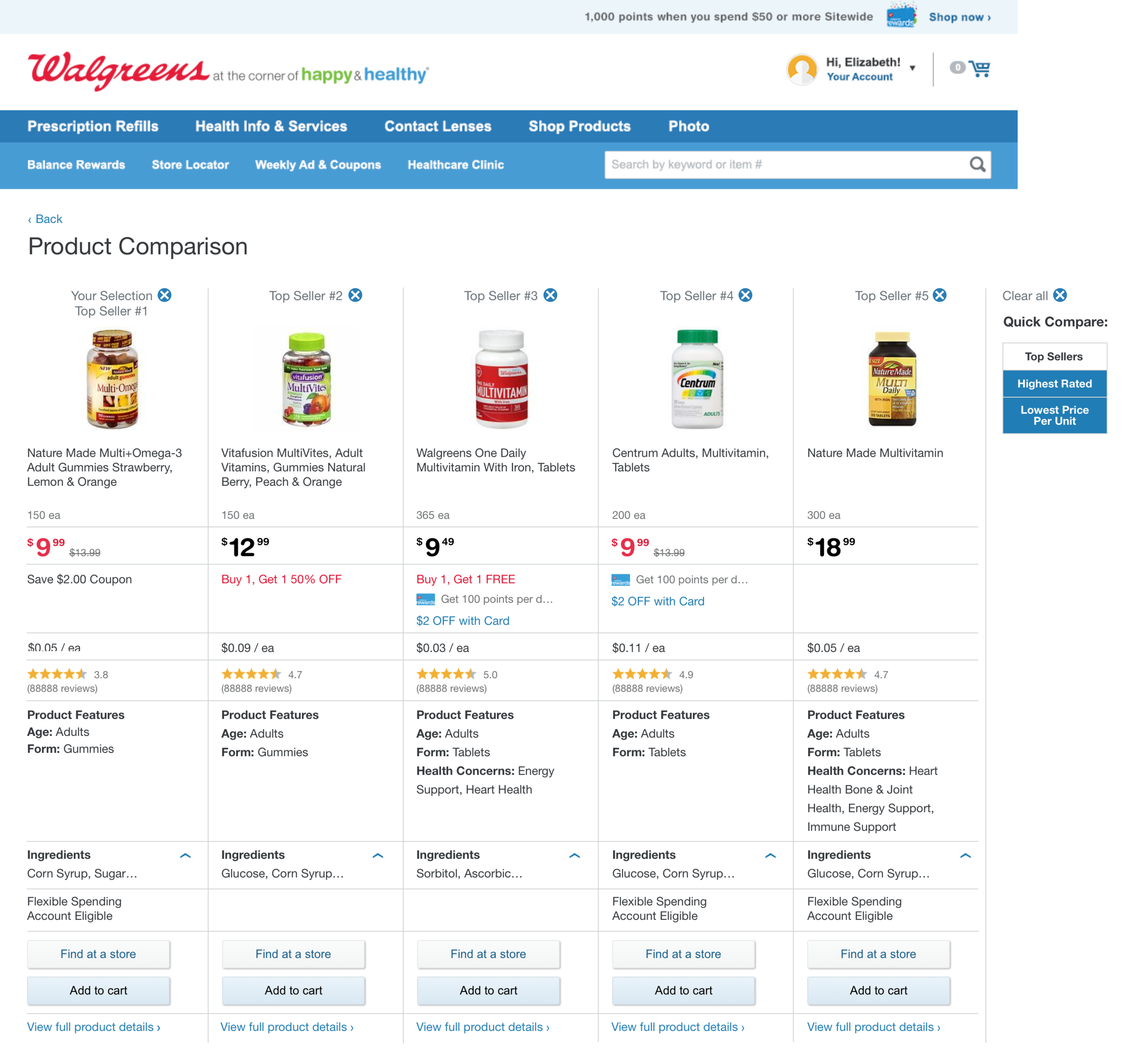
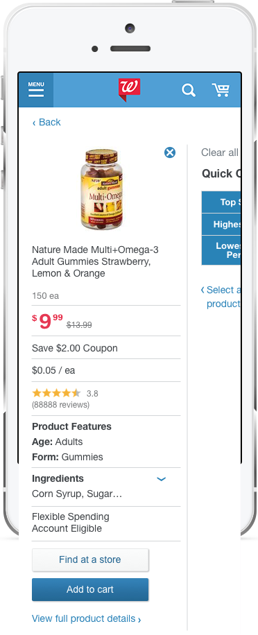
Users were looking for an easier way to compare prices, reviews, savings, and other features between products. We were tasked with finding a mobile first solution.
Research + Discovery
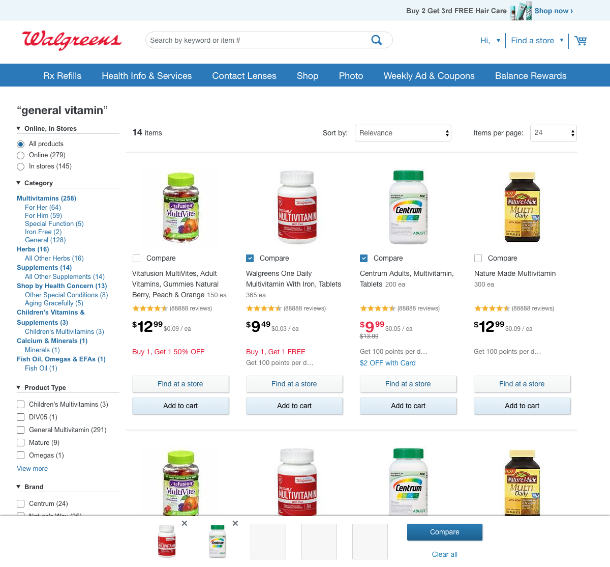
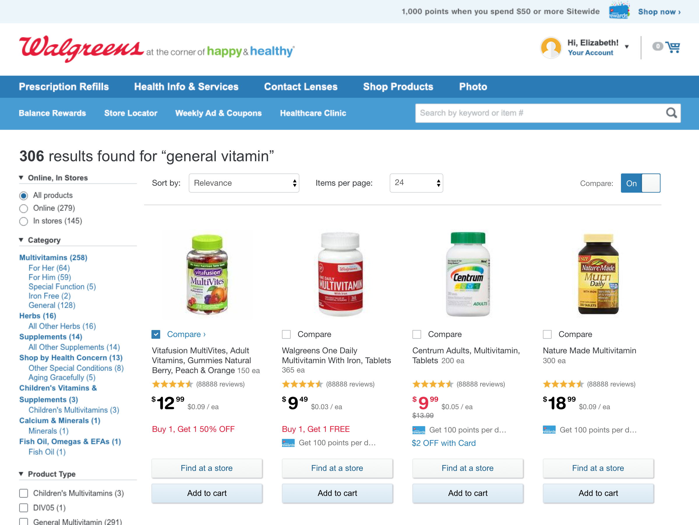
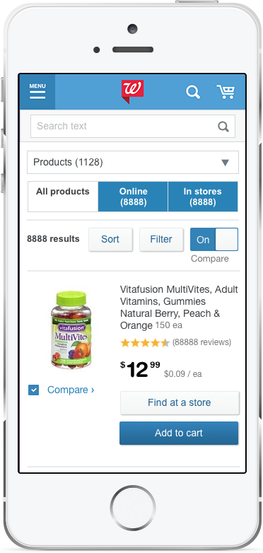
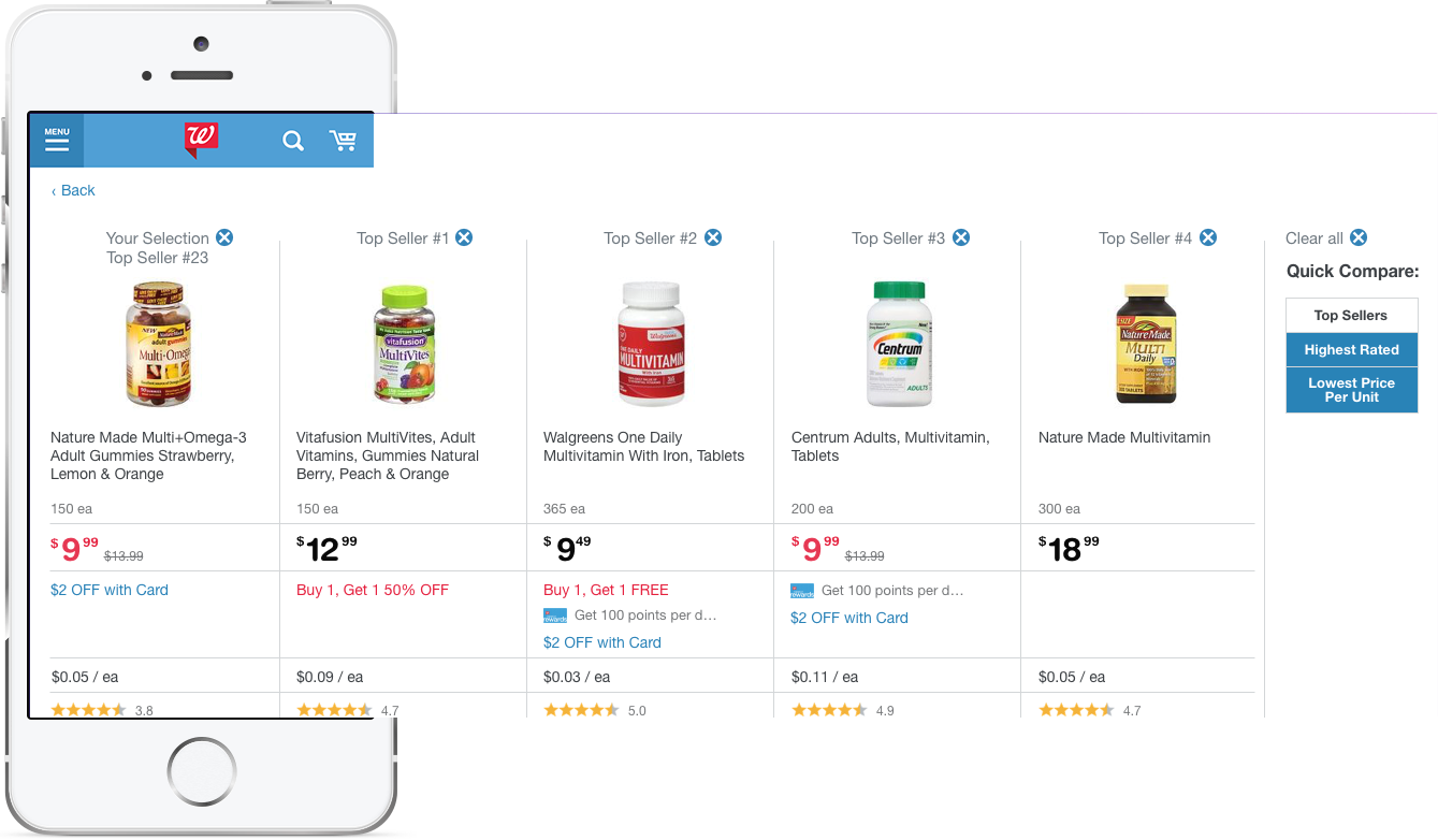
Through competitive analysis, we found most sites only had an option to compare products on desktop view. We found the best practice was to use a checkbox to select which products to compare.
Process
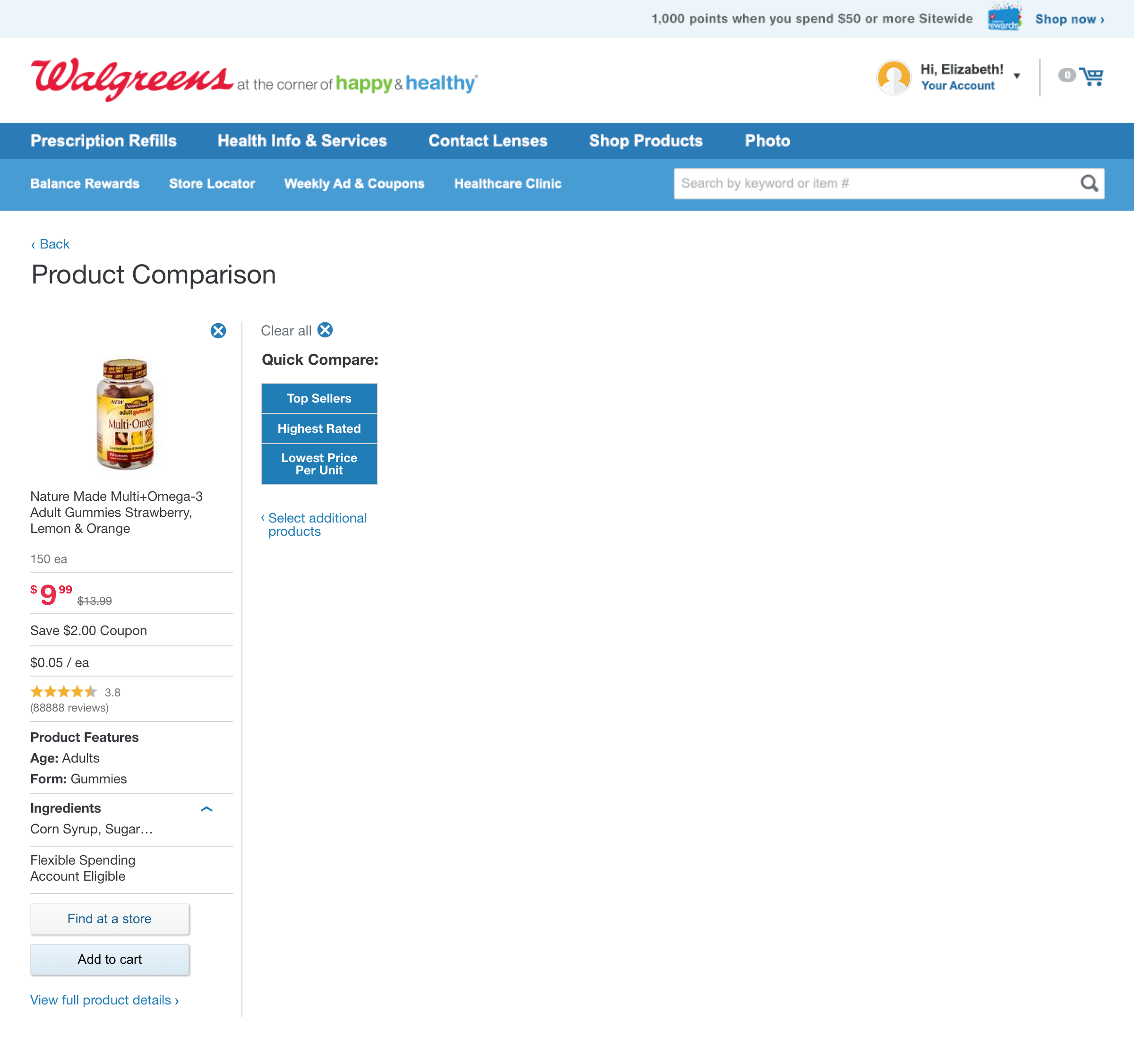
From the initial brainstorming sessions, I worked closely with the primary UX designer to understand user needs and flows. We created a "Quick Compare" function that allows users to compare one product against products that are top sellers, highest rated, and lowest price per unit. We aimed to create a minimal viable product that worked for all adaptive views.
The UX designer and I created wireframes and comps simultaneously so that design challenges could be discovered and resolved sooner. We met with the associate creative director, UX lead, business analyst, product manager, and development lead 1-2 times per week and iterated based on feedback. All team members' feedback was taken into consideration to make decisions that best fit user, business, brand, and technical requirements. Also met with upper management to present a prototype and iterated again based on feedback.
Challenges
From a visual design perspective, we wanted to keep the product cards as simple as possible by not adding more elements than were already existing. Our solution was to hide the compare checkboxes with an on/off toggle so that the user could choose if she wanted to compare.
Prototype
A prototype was presented to upper management. See the prototype.
Testing
QA Testing and Bug Bash during development to find defects.
A/B testing
Updates in Subsequent Sprints
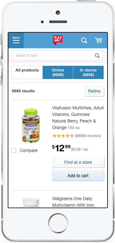
On mobile, combined Sort and Filter buttons into one button, Refine, to allow more space for the toggle.
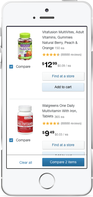
Added a drawer for users to preview the products they had selected to compare.
Removed the toggle so checkboxes are always visible.
Results